Introduction
What is CSS?
- CSS stands for Cascading Style Sheets
- CSS describes how HTML elements are to be displayed on screen, paper, or in other media
- CSS saves a lot of work. It can control the layout of multiple web pages all at once
- External stylesheets are stored in CSS files
CSS is used to define styles for your web pages, including the design, layout and variations in display for different devices and screen sizes.
- CSS solved a big problem
HTML was NEVER intended to contain tags for formatting a web page!
HTML was created to describe the content of a web page, like:
<h1>This is a heading</h1>
<p>This is a paragraph.</p>
When tags like <font>, and color attributes were added to the HTML 3.2 specification, it started a nightmare for web developers. Development of large websites, where fonts and color information were added to every single page, became a long and expensive process.
To solve this problem, the World Wide Web Consortium (W3C) created CSS.
CSS removed the style formatting from the HTML page!
Selectors
CSS selectors are used to "find" (or select) the HTML elements you want to style.
We can divide CSS selectors into five categories:
- Simple selectors (select elements based on name, id, class)
- Combinator selectors (select elements based on a specific relationship between them)
- Pseudo-class selectors (select elements based on a certain state)
- Pseudo-elements selectors (select and style a part of an element)
- Attribute selectors (select elements based on an attribute or attribute value)
- The CSS universal selector
The universal selector (*) selects all HTML elements on the page.
* {
    text-align: center;
    color: blue;
}
- All CSS simple selectors
- Selector - Example - Example description
- .class - .intro - Selects all elements with class="intro"
- #id - #firstname - Selects the element with id="firstname"
- * - * - Selects all elements
- element - p - Selects all <p> elements
- element, element, ... - div, p - Selects all <div> elements and all <p> elements
Cascading order
What style will be used when there is more than one style specified for an HTML element?
All the styles in a page will "cascade" into a new "virtual" style sheet by the following rules, where number one has the highest priority:
- Inline style (inside an HTML element)
- External and internal style sheets (in the head section)
- Browser default
So, an inline style has the highest priority, and will override external and internal styles and browser defaults.
Backgrounds
The CSS background properties are used to define the background effects for elements.
CSS background properties:
- background-color
- background-image
- background-repeat
- background-attachment
- background-position
- Shorthand property
To shorten the code, it is also possible to specify all the background properties in one single property. This is called a shorthand property. The shorthand property for background is background.
When using the shorthand property the order of the property values is:
- background-color
- background-image
- background-repeat
- background-attachment
- background-position
Margins
The CSS margin properties are used to create space around elements, outside of any defined borders.
With CSS, you have full control over the margins. There are properties for setting the margin for each side of an element (top, right, bottom, and left).
CSS has properties for specifying the margin for each side of an element:
- margin-top
- margin-right
- margin-bottom
- margin-left
All the margin properties can have the following values:
- auto - the browser calculates the margin
- length - specifies a margin in px, pt, cm, etc.
- % - specifies a margin in % of the width of the containing element
- inherit - specifies that the margin should be inherited from the parent element
Tip: Negative values are allowed.
- If the margin property has four values:
margin: 25px 50px 75px 100px;
- top margin is 25px
- right margin is 50px
- bottom margin is 75px
- left margin is 100px
- If the margin property has three values:
margin: 25px 50px 75px;
- top margin is 25px
- right and left margins are 50px
- bottom margin is 75px
- If the margin property has two values:
margin: 25px 50px;
- top and bottom margins are 25px
- right and left margins are 50px
- If the margin property has one value:
margin: 25px;
- all four margins are 25px
- The auto value
You can set the margin property to auto to horizontally center the element within its container. The element will then take up the specified width, and the remaining space will be split equally between the left and right margins.
div {
    width: 300px;
    margin: auto;
    border: 1px solid red;
}
- The inherit value
This example lets the left margin of the <p class="ex1"> element be inherited from the parent element (<div>):
<!DOCTYPE html>
<html>
	<head>
		<style>
			div {
				border: 1px solid red;
				margin-left: 100px;
			}
			p.ex1 {
				margin-left: inherit;
			}
		</style>
	</head>
	<body>
		<h2>Use of the inherit value</h2>
		<p>Let the left margin be inherited from the parent element:</p>

		<div>
			<p class="ex1">This paragraph has an inherited left margin (from the div element).</p>
		</div>
	</body>
</html>
Padding
The CSS padding properties are used to generate space around an element's content, inside of any defined borders. With CSS, you have full control over the padding. There are properties for setting the padding for each side of an element (top, right, bottom, and left).
CSS has properties for specifying the padding for each side of an element:
- padding-top
- padding-right
- padding-bottom
- padding-left
All the padding properties can have the following values:
- length - specifies a padding in px, pt, cm, etc.
- % - specifies a padding in % of the width of the containing element
- inherit - specifies that the padding should be inherited from the parent element
Note: Negative values are not allowed.
Height and Width
All CSS dimension properties:
- height - Sets the height of an element
- max-height - Sets the maximum height of an element
- max-width - Sets the maximum width of an element
- min-height - Sets the minimum height of an element
- min-width - Sets the minimum width of an element
- width - Sets the width of an element
Box model
All HTML elements can be considered as boxes. In CSS, the term "box model" is used when talking about design and layout.
The CSS box model is essentially a box that wraps around every HTML element. It consists of: margins, borders, padding, and the actual content. The image below illustrates the box model:
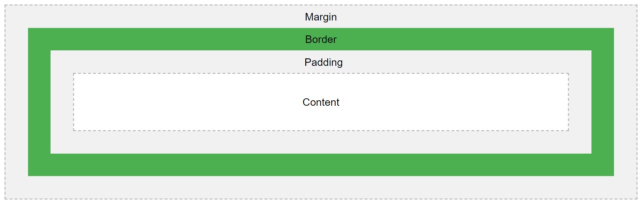
Explanation of the different parts:
- Content - The content of the box, where text and images appear
- Padding - Clears an area around the content. The padding is transparent
- Border - A border that goes around the padding and content
- Margin - Clears an area outside the border. The margin is transparent
The box model allows us to add a border around elements, and to define space between elements.
Counters
CSS counters are "variables" maintained by CSS whose values can be incremented by CSS rules (to track how many times they are used). Counters let you adjust the appearance of content based on its placement in the document.
- Automatic numbering with counters
CSS counters are like "variables". The variable values can be incremented by CSS rules (which will track how many times they are used).
To work with CSS counters we will use the following properties:
- counter-reset - Creates or resets a counter
- counter-increment - Increments a counter value
- content - Inserts generated content
- counter() or counters() function - Adds the value of a counter to an element
To use a CSS counter, it must first be created with counter-reset.
The following example creates a counter for the page (in the body selector), then increments the counter value for each <h2> element and adds "Section <value of the counter>:" to the beginning of each <h2> element:
<!DOCTYPE html>
<html>
	<head>
		<style>
			body {
				counter-reset: section;
			}

			h2::before {
				counter-increment: section;
				content: "Section " counter(section) ": ";
			}
		</style>
	</head>
	<body>
		<h1>Using CSS Counters:</h1>
		<h2>HTML Tutorial</h2>
		<h2>CSS Tutorial</h2>
		<h2>JavaScript Tutorial</h2>

		<p><b>Note:</b> IE8 supports these properties only if a !DOCTYPE is specified.</p>
	</body>
</html>
Web fonts
Web fonts allow Web designers to use fonts that are not installed on the user's computer. When you have found/bought the font you wish to use, just include the font file on your web server, and it will be automatically downloaded to the user when needed. Your "own" fonts are defined within the CSS @font-face rule.
Different font formats:
- TrueType Fonts (TTF)
TrueType is a font standard developed in the late 1980s, by Apple and Microsoft. TrueType is the most common font format for both the Mac OS and Microsoft Windows operating systems.
- OpenType Fonts (OTF)
OpenType is a format for scalable computer fonts. It was built on TrueType, and is a registered trademark of Microsoft. OpenType fonts are used commonly today on the major computer platforms.
- The Web Open Font Format (WOFF)
WOFF is a font format for use in web pages. It was developed in 2009, and is now a W3C Recommendation. WOFF is essentially OpenType or TrueType with compression and additional metadata. The goal is to support font distribution from a server to a client over a network with bandwidth constraints.
- The Web Open Font Format (WOFF 2.0)
TrueType/OpenType font that provides better compression than WOFF 1.0.
- SVG Fonts/Shapes
SVG fonts allow SVG to be used as glyphs when displaying text. The SVG 1.1 specification define a font module that allows the creation of fonts within an SVG document. You can also apply CSS to SVG documents, and the @font-face rule can be applied to text in SVG documents.
- Embedded OpenType Fonts (EOT)
EOT fonts are a compact form of OpenType fonts designed by Microsoft for use as embedded fonts on web pages.
- Browser support for font formats
The numbers in the table specifies the first browser version that fully supports the font format.
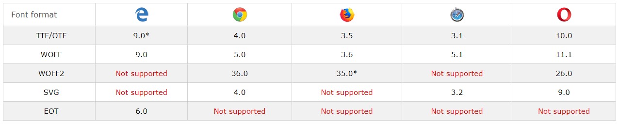
*IE: The font format only works when set to be "installable".
*Firefox: Not supported by default, but can be enabled (need to set a flag to "true" to use WOFF2).
Resize
The resize property specifies if (and how) an element should be resizable by the user.
The following example lets the user resize only the width of a <div> element:
<!DOCTYPE html>
<html>
	<head>
		<style>
			div {
				border: 2px solid;
				padding: 20px;
				width: 300px;
				resize: horizontal;
				overflow: auto;
			}
		</style>
	</head>
	<body>
		<div>
			<p>Let the user resize only the width of this div element.</p>
			<p>To resize: Click and drag the bottom right corner of this div element.</p>
		</div>
	</body>
</html>
The following example lets the user resize only the height of a <div> element:
div {
    resize: vertical;
    overflow: auto;
}
The following example lets the user resize both the height and width of a <div> element:
div {
    resize: both;
    overflow: auto;
}
In many browsers, <textarea> is resizable by default. Here, we have used the resize property to disable the resizability:
textarea {
    resize: none;
}
Variables
The var() function can be used to insert the value of a custom property.
Variables in CSS should be declared within a CSS selector that defines its scope. For a global scope you can use either the :root or the body selector.
The variable name must begin with two dashes (--) and is case sensitive! The syntax of the var() function is as follows:
var(custom-name, value)
The following example first defines a global custom property named "--main-bg-color", then it uses the var() function to insert the value of the custom property later in the style sheet:
<!DOCTYPE html>
<html>
	<head>
		<style>
			:root {
				--main-bg-color: #ffee00;
			}

			#div1 {
				background-color: var(--main-bg-color);
				padding: 5px;
			}

			#div2 {
				background-color: var(--main-bg-color);
				padding: 5px;
			}

			#div3 {
				background-color: var(--main-bg-color);
				padding: 5px;
			}
		</style>
	</head>
	<body>
		<div id="div1">Lorem ipsum dolor sit amet, consectetur adipiscing elit. Etiam semper diam at erat pulvinar, at pulvinar felis blandit.</div>
		<br>
		<div id="div2">Lorem ipsum dolor sit amet, consectetur adipiscing elit. Etiam semper diam at erat pulvinar, at pulvinar felis blandit.</div>
		<br>
		<div id="div3">Lorem ipsum dolor sit amet, consectetur adipiscing elit. Etiam semper diam at erat pulvinar, at pulvinar felis blandit.</div>
	</body>
</html>
The following example uses the var() function to insert several custom property values:
:root {
	--main-bg-color: coral;
	--main-txt-color: blue;
	--main-padding: 15px;
}

#div1 {
	background-color: var(--main-bg-color);
	color: var(--main-txt-color);
	padding: var(--main-padding);
}

#div2 {
	background-color: var(--main-bg-color);
	color: var(--main-txt-color);
	padding: var(--main-padding);
}
Media queries
- CSS2 introduced media types
The @media rule, introduced in CSS2, made it possible to define different style rules for different media types.
Examples: You could have one set of style rules for computer screens, one for printers, one for handheld devices, one for television-type devices, and so on.
Unfortunately these media types never got a lot of support by devices, other than the print media type.
- CSS3 introduced media queries
Media queries in CSS3 extended the CSS2 media types idea: Instead of looking for a type of device, they look at the capability of the device.
Media queries can be used to check many things, such as:
- width and height of the viewport
- width and height of the device
- orientation (is the tablet/phone in landscape or portrait mode?)
- resolution
Using media queries are a popular technique for delivering a tailored style sheet to desktops, laptops, tablets, and mobile phones (such as iPhone and Android phones).
- Media query syntax
A media query consists of a media type and can contain one or more expressions, which resolve to either true or false.
@media not|only mediatype and (expressions) {
    CSS-Code;
}
The result of the query is true if the specified media type matches the type of device the document is being displayed on and all expressions in the media query are true. When a media query is true, the corresponding style sheet or style rules are applied, following the normal cascading rules.
Unless you use the not or only operators, the media type is optional and the all type will be implied.
You can also have different stylesheets for different media:
<link rel="stylesheet" media="mediatype and|not|only (expressions)" href="print.css">
- Media types
- all - Used for all media type devices
- print - Used for printers
- screen - Used for computer screens, tablets, smart-phones etc.
- speech - Used for screenreaders that "reads" the page out loud
- Media queries simple examples
One way to use media queries is to have an alternate CSS section right inside your style sheet.
The following example changes the background-color to lightgreen if the viewport is 480 pixels wide or wider (if the viewport is less than 480 pixels, the background-color will be pink):
<!DOCTYPE html>
<html>
	<head>
		<style>
			body {
				background-color: pink;
			}

			@media screen and (min-width: 480px) {
				body {
					background-color: lightgreen;
				}
			}
		</style>
	</head>
	<body>
		<h1>Resize the browser window to see the effect!</h1>
		<p>The media query will only apply if the media type is screen and the viewport is 480px wide or wider.</p>
	</body>
</html>
Functions
CSS functions are used as a value for various CSS properties.
- attr() - Returns the value of an attribute of the selected element
- calc() - Allows you to perform calculations to determine CSS property values
- cubic-bezier() - Defines a Cubic Bezier curve
- hsl() - Defines colors using the Hue-Saturation-Lightness model (HSL)
- hsla() - Defines colors using the Hue-Saturation-Lightness-Alpha model (HSLA)
- linear-gradient() - Sets a linear gradient as the background image. Define at least two colors (top to bottom)
- radial-gradient() - Sets a radial gradient as the background image. Define at least two colors (center to edges)
- repeating-linear-gradient() - Repeats a linear gradient
- repeating-radial-gradient() - Repeats a radial gradient
- rgb() - Defines colors using the Red-Green-Blue model (RGB)
- rgba() - Defines colors using the Red-Green-Blue-Alpha model (RGBA)
- var() - Inserts the value of a custom property
- attr()
The following example inserts the value of the href attribute in parenthesis after each link:
<!DOCTYPE html>
<html>
	<head>
		<style>
			a:after {
				content: " (" attr(href) ")";
			}
		</style>
	</head>
	<body>
		<h1>The attr() Function</h1>

		<p>Insert the value of the href attribute in parenthesis after each link:</p>

		<p><a href="https://www.w3schools.com">Visit W3Schools</a></p>
		<p><a href="https://www.w3schools.com/html/">Visit W3Schools' HTML tutorial</a></p>
	</body>
</html>
The attr() function returns the value of an attribute of the selected elements.
- calc()
Use calc() to calculate the width of a <div> element:
<!DOCTYPE html>
<html>
	<head>
		<style>
			#div1 {
				position: absolute;
				left: 50px;
				width: calc(100% - 100px);
				border: 1px solid black;
				background-color: yellow;
				padding: 5px;
				text-align: center;
			}
		</style>
	</head>
	<body>
		<h1>The calc() Function</h1>

		<p>Create a div that stretches across the window, with a 50px gap between both sides of the div and the edges of the window:</p>

		<div id="div1">Some text...</div>
	</body>
</html>
The calc() function performs a calculation to be used as the property value.
- cubic-bezier()
A transition effect with variable speed from start to end:
<!DOCTYPE html>
<html>
	<head>
		<style>
			div {
				width: 100px;
				height: 100px;
				background: red;
				transition: width 2s;
				transition-timing-function: cubic-bezier(0.1, 0.7, 1.0, 0.1);
			}

			div:hover {
				width: 300px;
			}
		</style>
	</head>
	<body>
		<h1>The cubic-bezier() Function</h1>

		<p>Hover over the div element below, to see the transition effect.</p>

		<div></div>

		<p><b>Note:</b> This example does not work in Internet Explorer 9 and earlier versions.</p>
	</body>
</html>
The cubic-bezier() function defines a Cubic Bezier curve.
A Cubic Bezier curve is defined by four points P0, P1, P2, and P3. P0 and P3 are the start and the end of the curve and, in CSS these points are fixed as the coordinates are ratios. P0 is (0, 0) and represents the initial time and the initial state, P3 is (1, 1) and represents the final time and the final state.
The cubic-bezier() function can be used with the animation-timing-function property and the transition-timing-function property.
- hsl()
Define different HSL colors:
#p1 {background-color:hsl(120,100%,50%);} /* green */
#p2 {background-color:hsl(120,100%,75%);} /* light green */
#p3 {background-color:hsl(120,100%,25%);} /* dark green */
#p4 {background-color:hsl(120,60%,70%);} /* pastel green */
The hsl() function define colors using the Hue-saturation-lightness model (HSL).
HSL stands for hue, saturation, and lightness - and represents a cylindrical-coordinate representation of colors.
- hsla()
Define different HSL colors with opacity:
#p1 {background-color:hsla(120,100%,50%,0.3);} /* green */
#p2 {background-color:hsla(120,100%,75%,0.3);} /* light green */
#p3 {background-color:hsla(120,100%,25%,0.3);} /* dark green */
#p4 {background-color:hsla(120,60%,70%,0.3);} /* pastel green */
The hsla() function define colors using the Hue-saturation-lightness-alpha model (HSLA).
HSLA color values are an extension of HSL color values with an alpha channel - which specifies the opacity of the color.
- linear-gradient()
This linear gradient starts at the top. It starts red, transitioning to yellow, then to blue:
#grad {
    background-image: linear-gradient(red, yellow, blue);
}
The linear-gradient() function sets a linear gradient as the background image.
To create a linear gradient you must define at least two color stops. Color stops are the colors you want to render smooth transitions among. You can also set a starting point and a direction (or an angle) along with the gradient effect.
- radial-gradient()
A radial gradient with evenly spaced color stops:
#grad {
    background-image: radial-gradient(red, green, blue);
}
The radial-gradient() function sets a radial gradient as the background image.
A radial gradient is defined by its center.
To create a radial gradient you must define at least two color stops.
- repeating-linear-gradient()
A repeating linear gradient:
#grad {
    background-image: repeating-linear-gradient(red, yellow 10%, green 20%);
}
The repeating-linear-gradient() function is used to repeat linear gradients.
- repeating-radial-gradient()
A repeating radial gradient:
#grad {
    background-image: repeating-radial-gradient(red, yellow 10%, green 15%);
}
The repeating-radial-gradient() function is used to repeat radial gradients.
- rgb()
Define different RGB colors:
#p1 {background-color:rgb(255,0,0);} /* red */
#p2 {background-color:rgb(0,255,0);} /* green */
#p3 {background-color:rgb(0,0,255);} /* blue */
The rgb() function define colors using the Red-green-blue (RGB) model.
An RGB color value is specified with: rgb(red, green, blue). Each parameter defines the intensity of that color and can be an integer between 0 and 255 or a percentage value (from 0% to 100%).
For example, the rgb(0,0,255) value is rendered as blue, because the blue parameter is set to its highest value (255) and the others are set to 0.
- rgba()
Define different RGB colors with opacity (RGBA):
#p1 {background-color:rgba(255,0,0,0.3);} /* red with opacity*/
#p2 {background-color:rgba(0,255,0,0.3);} /* green with opacity */
#p3 {background-color:rgba(0,0,255,0.3);} /* blue with opacity */
The rgba() function define colors using the Red-green-blue-alpha (RGBA) model.
RGBA color values are an extension of RGB color values with an alpha channel - which specifies the opacity of the color.
- var()
First define a custom property named "--main-bg-color", then use the var() function to insert the value of the custom property later in the style sheet:
:root {
    --main-bg-color: coral;
}

#div1 {
    background-color: var(--main-bg-color);
}

#div2 {
    background-color: var(--main-bg-color);
}
The var() function is used to insert the value of a custom property instead of any part of a value of another property.
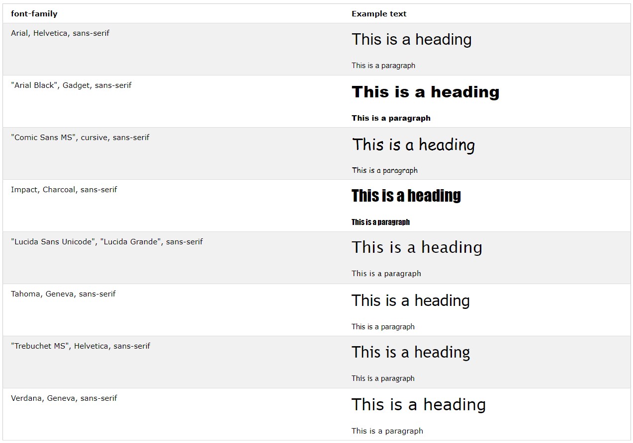
Web safe font combinations
The font-family property should hold several font names as a "fallback" system, to ensure maximum compatibility between browsers/operating systems. If the browser does not support the first font, it tries the next font.
Start with the font you want, and end with a generic family, to let the browser pick a similar font in the generic family, if no other fonts are available:
p {
    font-family: "Times New Roman", Times, serif;
}
Below are some commonly used font combinations, organized by generic family.
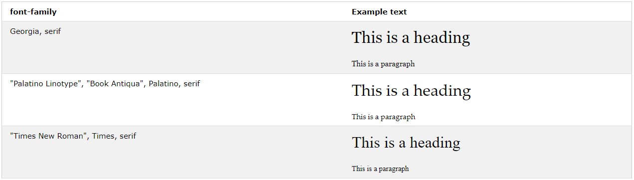
- Serif fonts
- Sans-Serif fonts
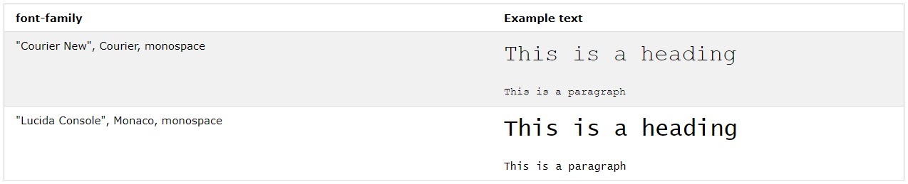
- Monospace fonts